DIMUTO • FARM MANAGEMENT DASHBOARD
Every farm, visible in one place
Redesigning a harvest logging tool into a data-driven operations dashboard for agricultural supply chain managers

The challenge
The platform recorded harvests but didn't help anyone use the data
DiMuto's farm management module let field workers log harvests and activities through a mobile app. The data was coming in, but the web platform just mirrored the mobile input screens — individual entries with no aggregation, no comparisons, no trends.
Managers who wanted to compare output across farmers or track field performance had to export to spreadsheets and do the analysis themselves.
Two audiences, one platform — different jobs
For this project, the product manager gathered requirements from Great Giant Fruit's team directly; I translated those into the interface.
Field workers (mobile — out of scope)
This group of users log harvests, record activities, and capture photos on-site. The mobile app already worked well for this.
Upper management and farm managers (web — my focus)
This group of users need to see not just what was harvested, but what it's worth. Different fruit grades carry different pricing, so a field producing mostly Grade A papayas is far more profitable than one producing Grade B. Managers needed harvest output tied to its monetary value, performance compared across farmers and fields, and a way to check whether output is meeting projections. All of this was not supported by the existing web interface.
Designing five tabs: one new, four redesigned
Overview tab: Farm performance and output at a glance
This tab didn't exist before. I added it as the Farm Management module's landing page so managers could see how the farm is performing without digging through individual records.
It shows monthly harvest output against projected targets, with stat cards for totals (harvests, revenue, fields, personnel) and time-series charts for spotting trends over time. A donut chart breaks down expenses by category. Date filters and farm selectors let managers adjust the view they want to see without leaving the page.

The Overview tab shows key farm stats (total harvest, expenses, profit), a harvest performance chart comparing actual output against expected targets over time, and an expense breakdown by category. Date and week selectors let managers adjust the view to any period.
Fields tab: Structured records with summary stats
Redesigned as a sortable, filterable table with stat cards at the top (total fields, currently harvesting, recorded harvests). The Create New Field form uses dropdowns for crop type and location to keep data consistent, instead of manual user input.
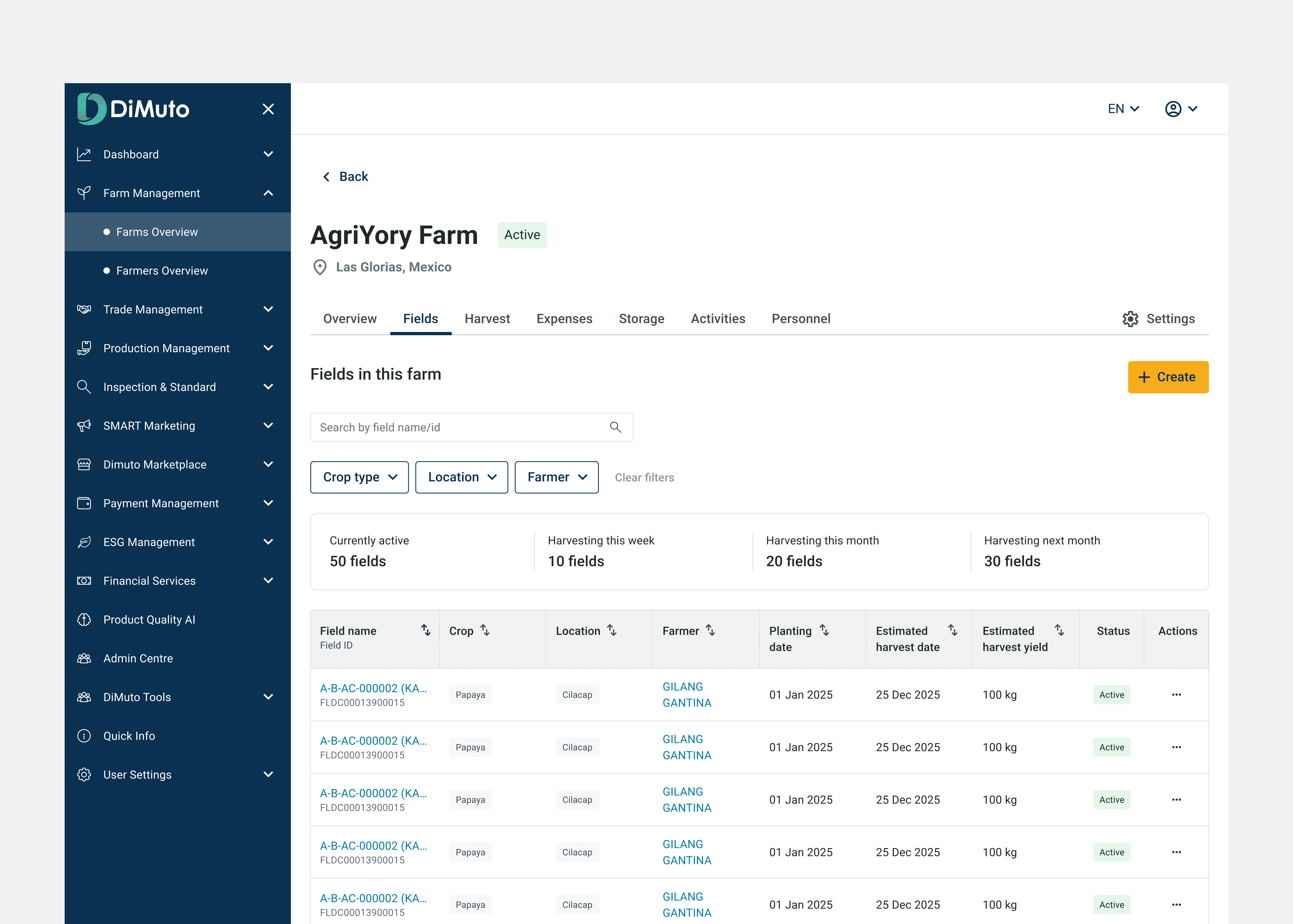
Fields listed with stat cards showing totals at a glance (currently active, harvesting this week/month, harvesting next month). Table columns include field name, crop, location, farmer, planting and estimated harvest dates, estimated yield, and status.

The Create New Field / Edit Existing Field form uses dropdowns for crop type, planting method, seed name, and location to keep data consistent across users instead of relying on manual text input.
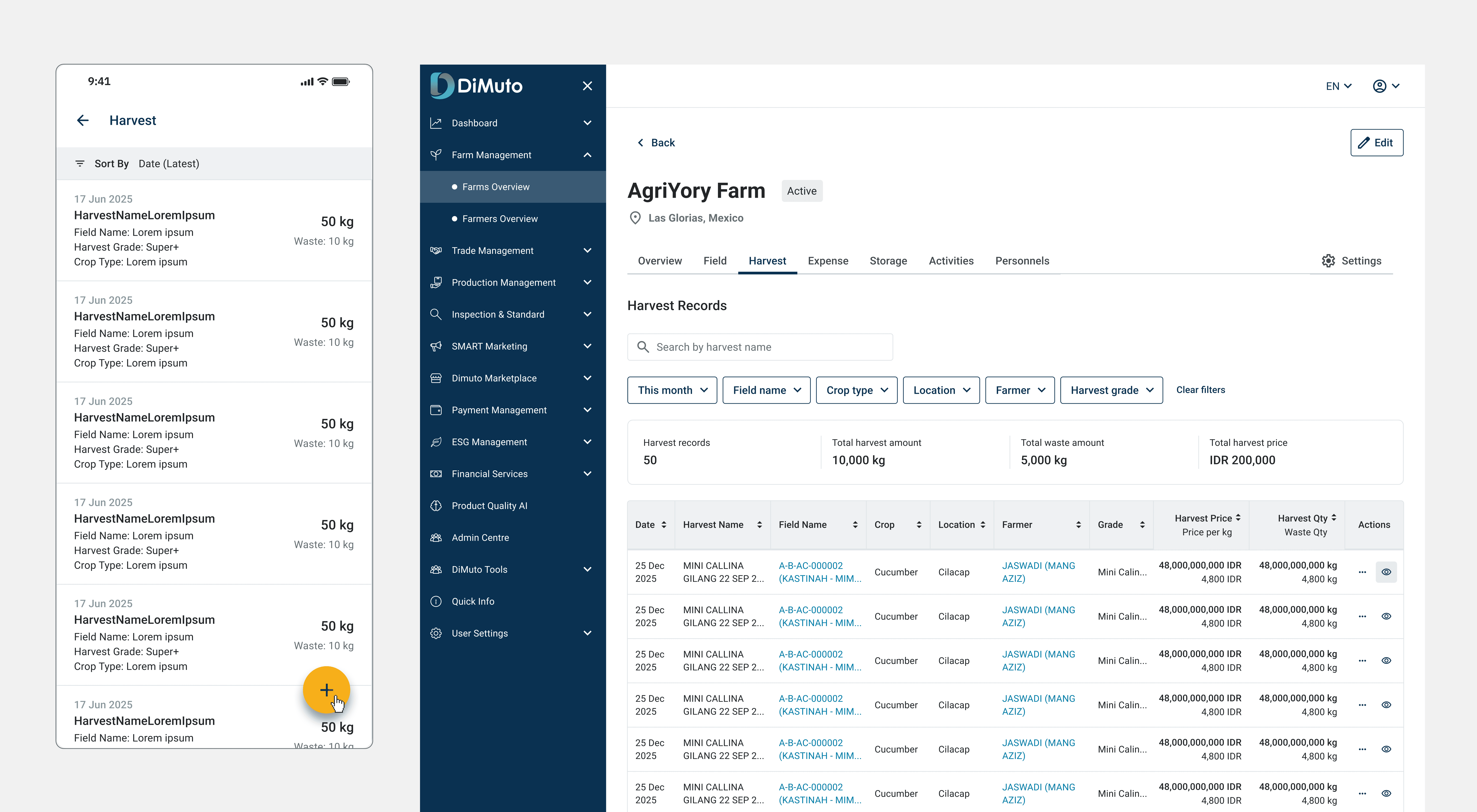
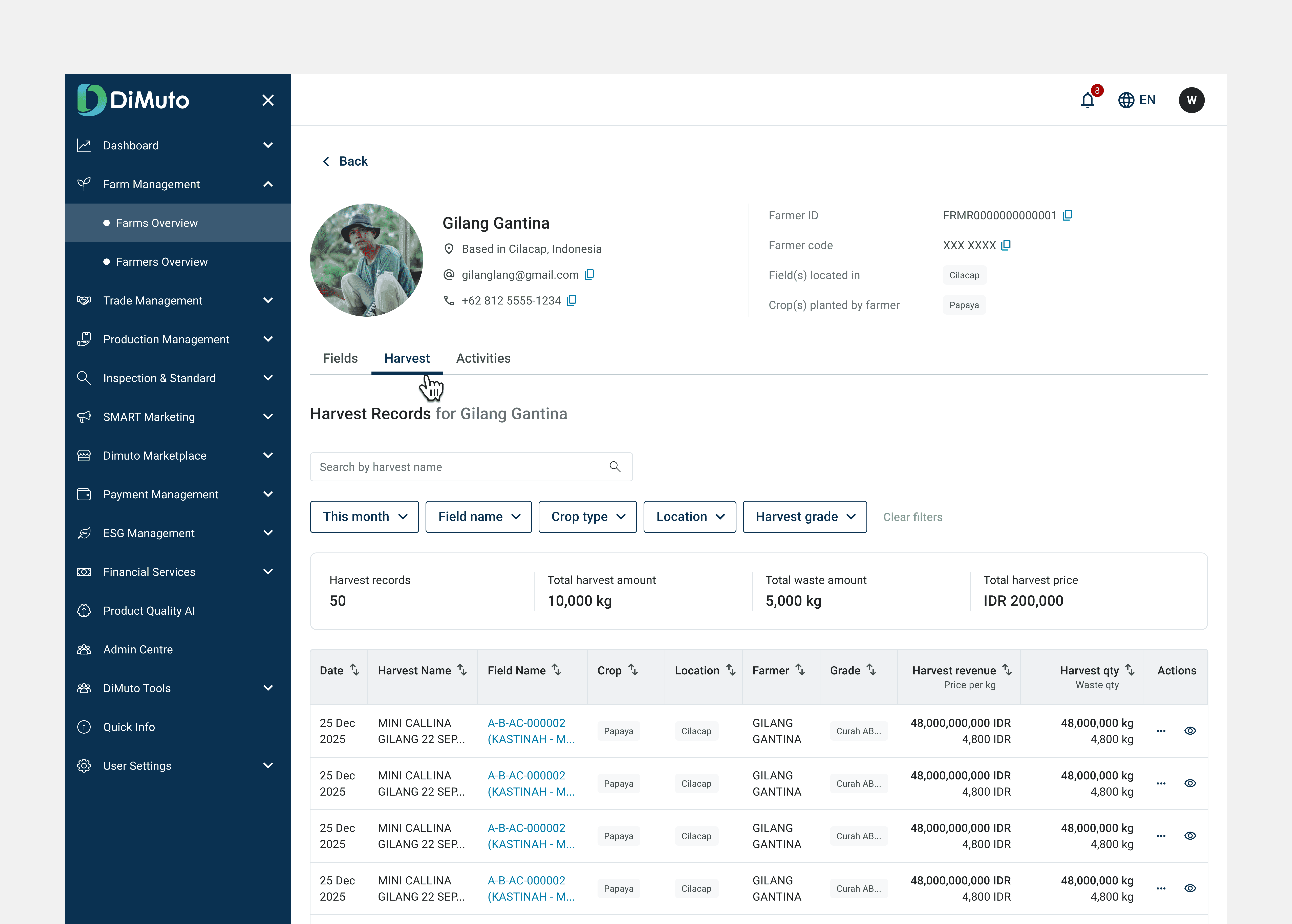
Harvest tab: Tying harvest output to revenue
The main decision here was showing harvest grade alongside quantity and revenue in the same row. A harvest record isn't just "500 kg of papayas", it's "500 kg of Grade A at X price per kg." Managers can see the potential revenue of the harvest output, not just volume.
Filters narrow results by time period, field, crop type, and grade, and the stat cards above the table update to reflect the filtered set. That means selecting "this week" instantly shows total harvest records, total harvest amount, waste, and total harvest revenue for that period. A hover interaction on each row reveals additional details (such as the Pack Plans it's linked to) without requiring a click-through.
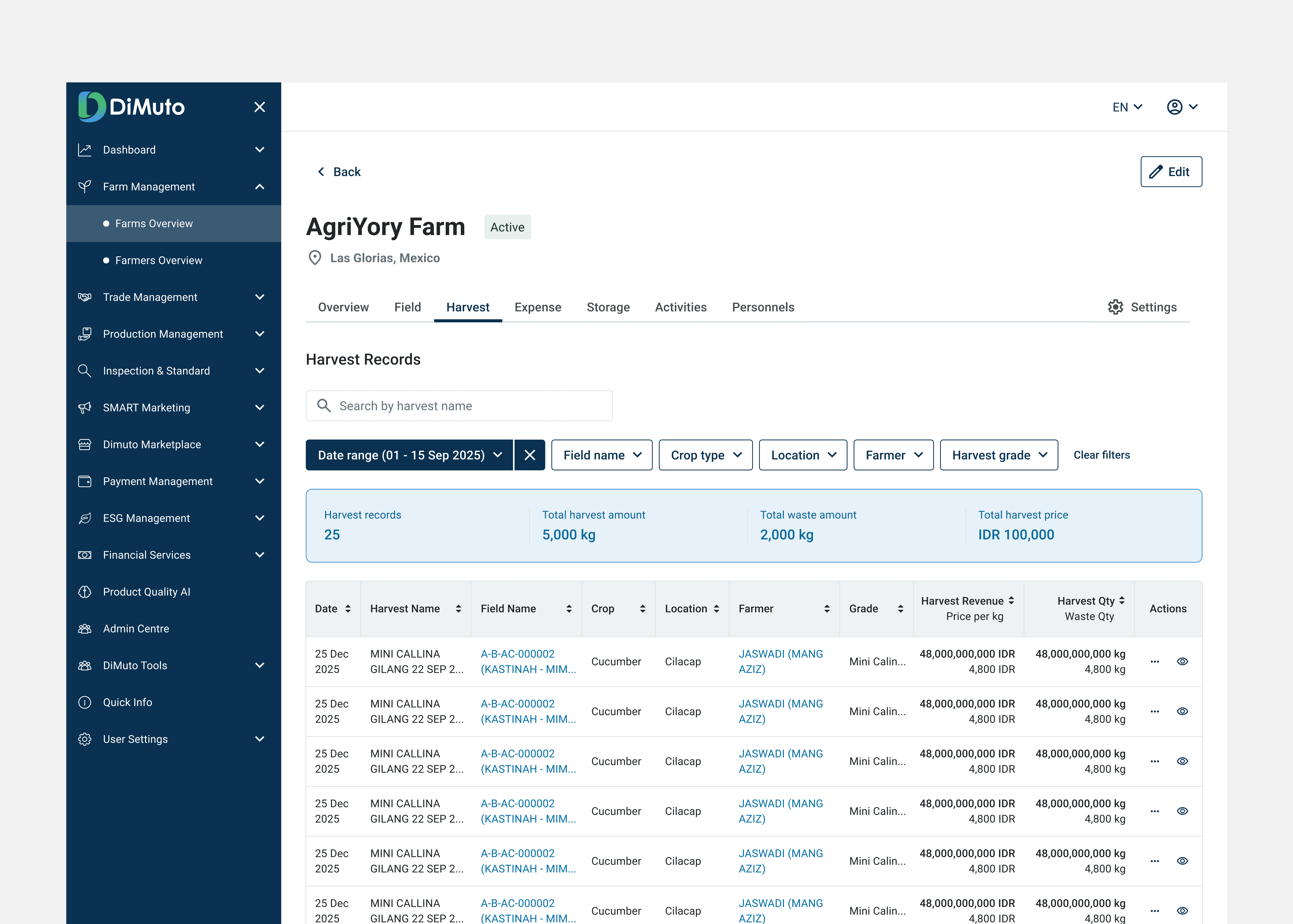
Harvest records show grade, price per kg, and quantity in the same row — tying output directly to its revenue. Stat cards above the table update to reflect the total of the filtered results (e.g. total harvest amount and total harvest price for the selected week).
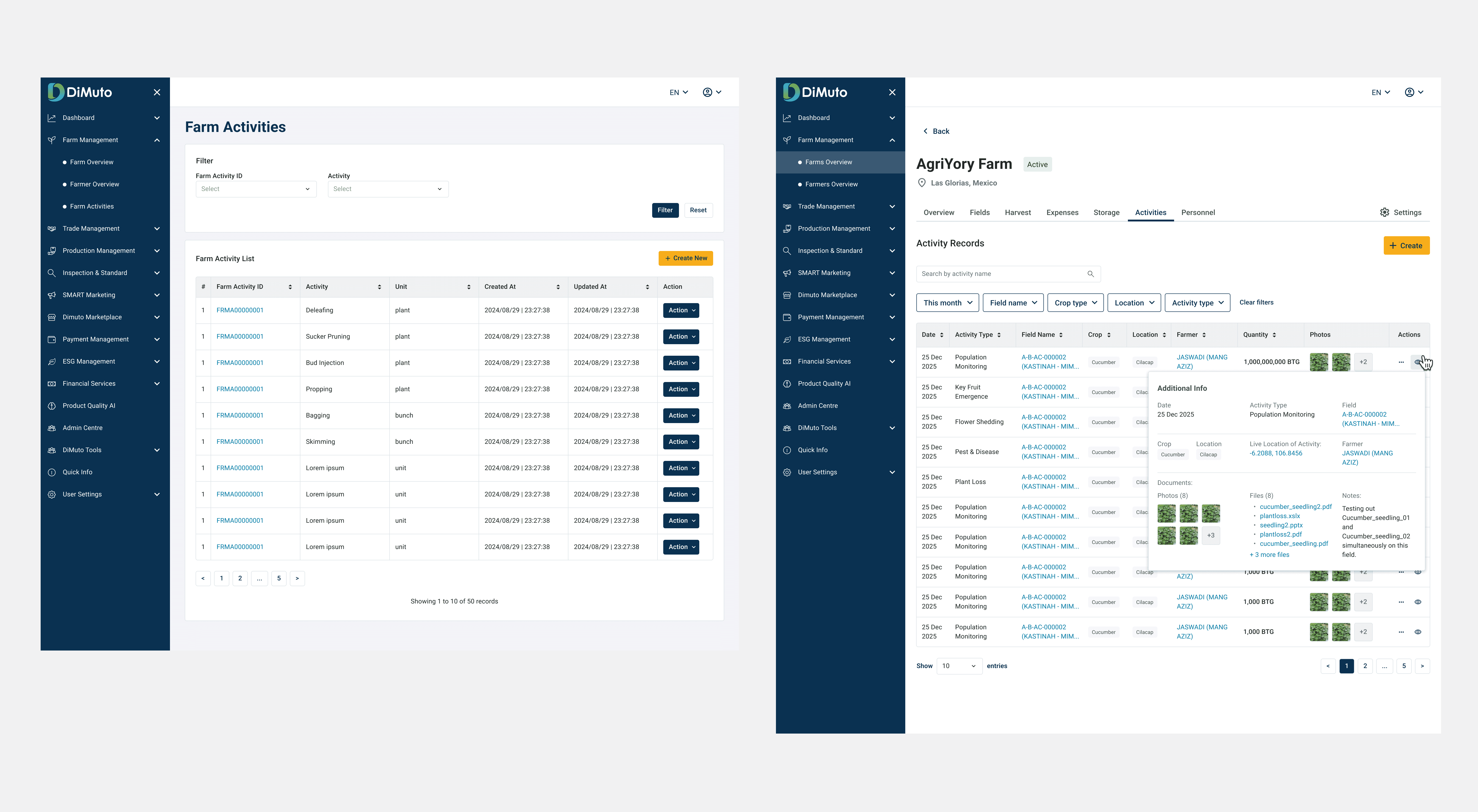
Activities: Additional context about the line item without leaving the page
Activities like pest monitoring, plant loss, and population tracking are logged on mobile. On web, I used an expandable "Additional Info" panel inline within the table row. This modal shows location, documents, photos, and notes, so managers don't have to click in and out of each record to understand what happened.
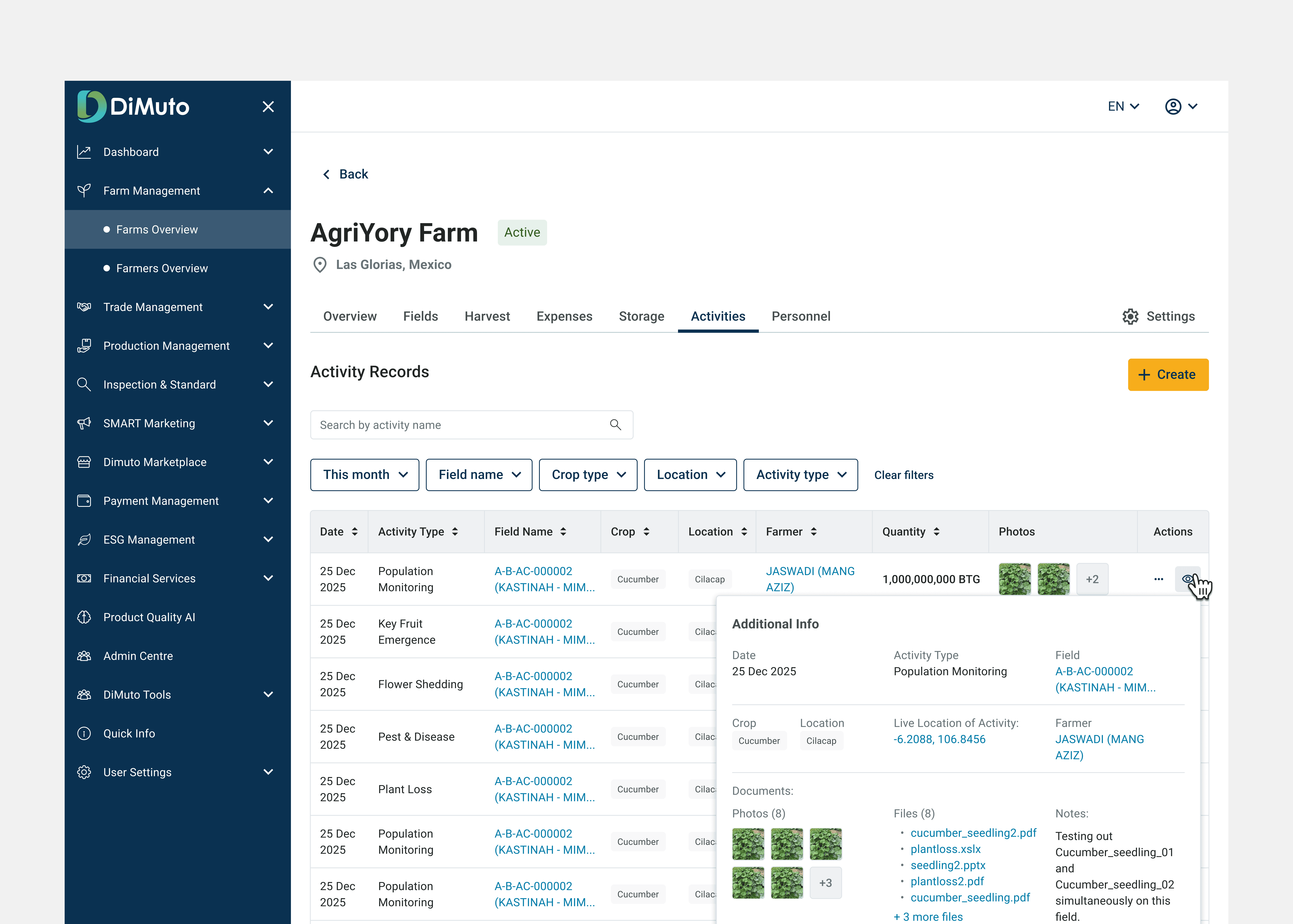
Activity records with inline photo thumbnails and an expandable Additional Info panel showing location coordinates, attached documents, photos, and field notes. This provides easy access for the managers and executives to see each record without leaving the page.
Personnel — output by farmer
The original tab was a name list with no farmer profile page. I redesigned it to show each farmer's output (locations, fields, grades, revenue, quantity) in sortable columns so managers can compare across their workforce.
An expandable row shows the farmer's profile without navigating away. I also created dedicated farmer profile pages with their own Fields, Harvest, and Activities sub-tabs. This allows for a filtered, per-person view useful for on-the-ground audits when managers visit the field and need to quickly check a specific farmer's output, assigned fields, and recent activities.

Farmer listing with sortable output columns (locations, fields, grades, revenue, quantity). Each row is tied to a face so farm managers are able to quickly identify the farmer associated with the field or harvest.
Individual farmer profile page with dedicated Fields, Harvest, and Activities sub-tabs — a filtered view of the farm's data scoped to one person, useful especially for on-the-ground field audits.
Settings tab: Farm-level configuration
Settings allow managers to define reusable values such as harvest grades, activity types, field categories. These populate across dropdowns across the module's forms. This keeps data consistent and saves time for users creating new records. Harvest grades are the most important since grade directly determines pricing throughout the module.
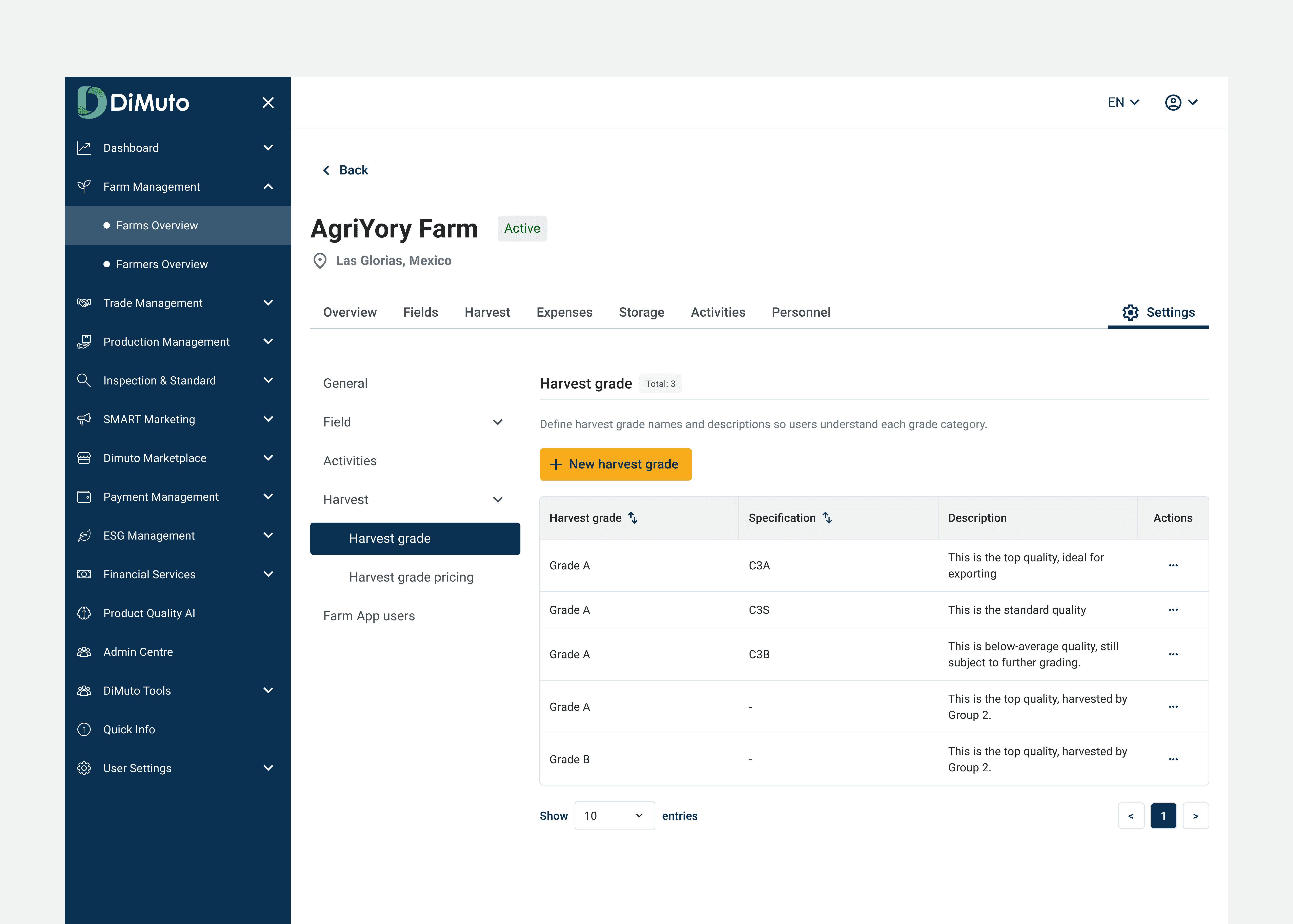
Farm-level settings for defining harvest grades, activity types, and other reusable values that populate dropdowns across the module's forms
Impact and Reflection
Live on Great Giant Fruit's papaya farm
The redesigned Farm Management module is live and in use by Great Giant Fruit's management team on their papaya farm. Before the redesign, managers were working with rows of raw data on the old platform. The Overview tab now gives them a performance snapshot without digging through records, and the filtered views across Harvest, Activities, and Personnel tabs let them narrow results by time period, field, crop, or farmer — with aggregated totals (total harvest amount, waste, revenue) updating to reflect the filtered set. Instead of exporting to spreadsheets to compare outputs, they can now see and compare results directly on the platform.
What I'd do differently
I didn't have direct access to end users during this project, since the requirements came through the product manager. If I could redo this, I'd push to observe a farm manager using the old interface firsthand before designing the new one. Even one session would have helped me prioritise which data points matter most in the Overview tab rather than working from secondhand requirements.
What's next
The Expenses and Storage tabs are still in their original state and could benefit from the same treatment (connecting raw records to aggregated insight.) A cross-farm comparison view would also be a natural next step, letting management compare performance across multiple farm locations instead of reviewing them one at a time.