DIMUTO • AGENTIC AI ASSISTANT
Designing DiMuto's agentic AI assistant — turning platform data into instant answers for every team member.

The challenge
Users dug through pages to find answers that should be instant
DiMuto digitises agricultural supply chains, moving trades from pen and paper onto a single platform end-to-end. But answering routine questions like settlement status, shipment risks, or finding specific details buried in trade contracts meant users always had to navigate multiple modules and pages to retrieve and manually piece data together.
The CEO saw a dual opportunity: give every team member instant answers from platform data, and position DiMuto as AI-forward to investors.
Competitive scan
Co-pilots, not chatbots: what Notion and Gemini taught us about trust and discoverability
I tested Notion AI and Gemini within Google Workspace hands-on, evaluating them against 18 metrics across onboarding, user experience, accuracy, and technical depth.
I also defined five supply-chain personas — Leadership (CEO/CFO), Commercial (sales teams), Operations (logistics managers), Compliance (export documentation), and Production/Quality (farm managers and QA). Each came with sample tasks to ground every design decision in real workflows.

Three findings that shaped the design most directly:
Discoverability and platform integration
Both assistants acted as co-pilots alongside their respective workspaces. They were persistent, accessible, but never blocking the user's primary task. We followed the same approach: a sidebar chat, accessed through an icon next to our platform's frequently used icons.
Onboarding
Notion's walkthrough was the most useful reference — video format with chat-based suggestions that oriented users quickly. We designed a skippable carousel paired with suggested questions for users unfamiliar with AI assistants.
Response framing builds trust
Notion displayed a first-liner clarifying intent before generating the full response (e.g., "Gathering financial performance data..."), giving users a chance to stop the response if the assistant is on the wrong track. We adopted this pattern and added a last-liner — a predictive question suggesting the user's likely next step. This encouraged continued conversation, giving us more data and feedback to improve the agent.
Project scoping
Three phases: prove accuracy first, automate later
Given tight timelines, we structured the design and build such that the agent's training builds on the previous phase:

Phase roadmap with objectives, rationale, and success criteria across all three phases. Phase 1 focused on data accuracy; design handover by end December, platform launch by late January.
Phase 1: "The Data Scientist"
Extract accurate insights from internal platform data. If users can't trust the answers, nothing else matters. We started with two key pages (Trade Contracts; Management Dashboard), based on the platform's two main target groups: sales/operations teams and upper management.
Phase 2: "The Optimiser"
Automate certain manual processes that users do daily.
Phase 3: "The Co-Pilot"
Proactive recommendations for business improvement and better decision-making.
Phase 1 had to prove retrieval accuracy before we could trust the assistant to take action, make recommendations, or source data from the web to answer users' questions. This also gave us a contained scope: Phase 1 design handover by end December, platform launch by late January.
Design process & design decisions
Side panel, not overlay
When a user opens the assistant, it compresses the screen they're currently on rather than overlaying on top of it — so users can reference their working context (e.g., a trade contract detail page, the management dashboard) while asking questions about it.
The assistant opens as a sidebar, compressing any page the user is on rather than overlaying it, keeping users' working context visible. The icon sits alongside frequently used icons for easy access.
Onboarding: getting first-time users comfortable with AI on our platform
The onboarding needed to accommodate all our users (with varying AI exposure) without slowing anyone down.
We designed three tiers: a "See how it works" button opens a 4-step walkthrough carousel for users who want guidance. "Ask DiMutoAI now" skips straight to the chat for users who are ready to go. Above the chat field, suggested questions organised by task type serve as a lighter form of onboarding — showing new users what the assistant can do, while acting as a shortcut for returning users (e.g., "Executive summary for Jan 2026").
4-step walkthrough carousel for users who want guidance.

The start page displays suggested questions above the chat field. This gives new users immediate examples of what to ask, while acting as one-tap shortcuts for returning users.
Chat input: helping the agent focus its search
The chat field includes a context selector that lets users narrow queries to a specific module (e.g., Farm Management, Orders, Financial Services). This helps the agent focus its search instead of scraping data across the entire platform, keeping output loading speeds to a minimum. File upload supports document-based workflows like compliance checks.

The context selector lets users narrow queries to specific modules (e.g. Trade Contracts; Management Dashboard), helping the agent focus its search and keep loading speeds to a minimum.
Chat output: structured formats for different audiences
Rather than trying to generate a distinct response for every possible question, I broke queries down into types — data lookups, summaries, comparisons, checklists — and designed a response format suited to each type. Each output follows a consistent structure: a first-liner confirming the assistant's understanding, the main output in the appropriate format, a last-liner with a follow-up question, and action CTAs.
Beyond this general structure, I also designed templated output formats tailored to the platform's most frequent users. An executive summary format gives leadership (CFO/COO) a consistent, scannable view they can pull up weekly or monthly for company financials. A trade contract format gives operations and sales teams a structured breakdown they can rely on. The goal was that users querying the same type of information would always get it in a familiar, easy-to-scan layout — rather than navigating the platform and assembling the information themselves.
Each response also includes a collapsible "See sources and reasoning" section, showing the exact documents and data the answer drew from. This lets users verify outputs without leaving the chat, building trust in the assistant over time.
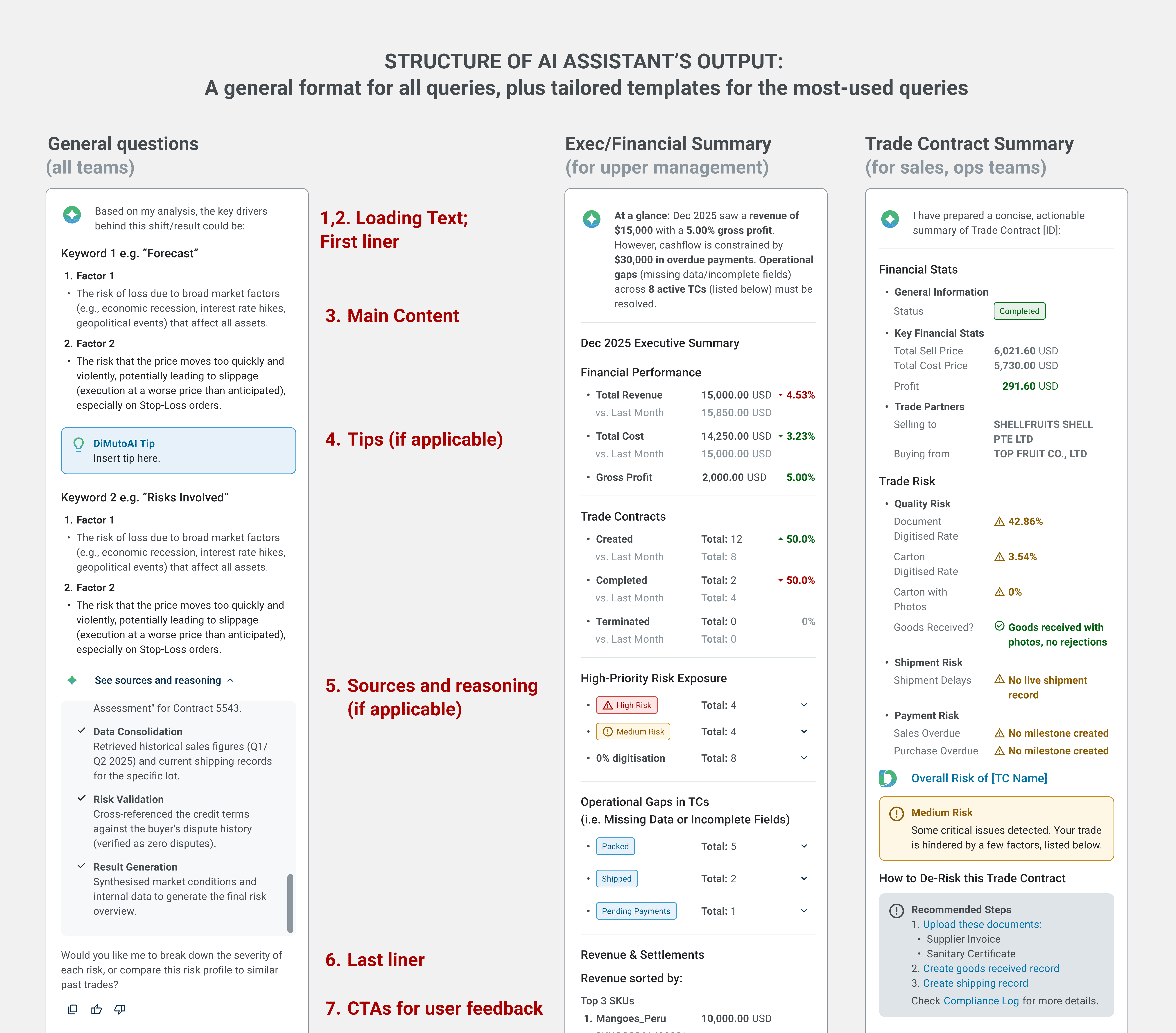
A general format for all queries (e.g. data lookup), plus tailored templates for the most-used pages (e.g., executive summary, trade contract)
5. Loading states and feedback: keeping users informed and in control
Loading states show a first-liner clarifying intent before the full response generates. This aims to assure users that the assistant is thinking about the right thing, rather than a generic "loading" indicator. Post-response CTAs include thumbs up/down, redo, and copy — ensuring easy access for common tasks while feeding user feedback directly into the evaluation framework.

Loading states use descriptive first-liners tailored to the query type. This assures users that the assistant understood their input and is working on the right thing, rather than showing a generic loading indicator.
Post-response CTAs allow for user quick actions. e.g. Thumbs down button triggers a feedback survey, closing the loop between user experience and model improvement.
Evaluation
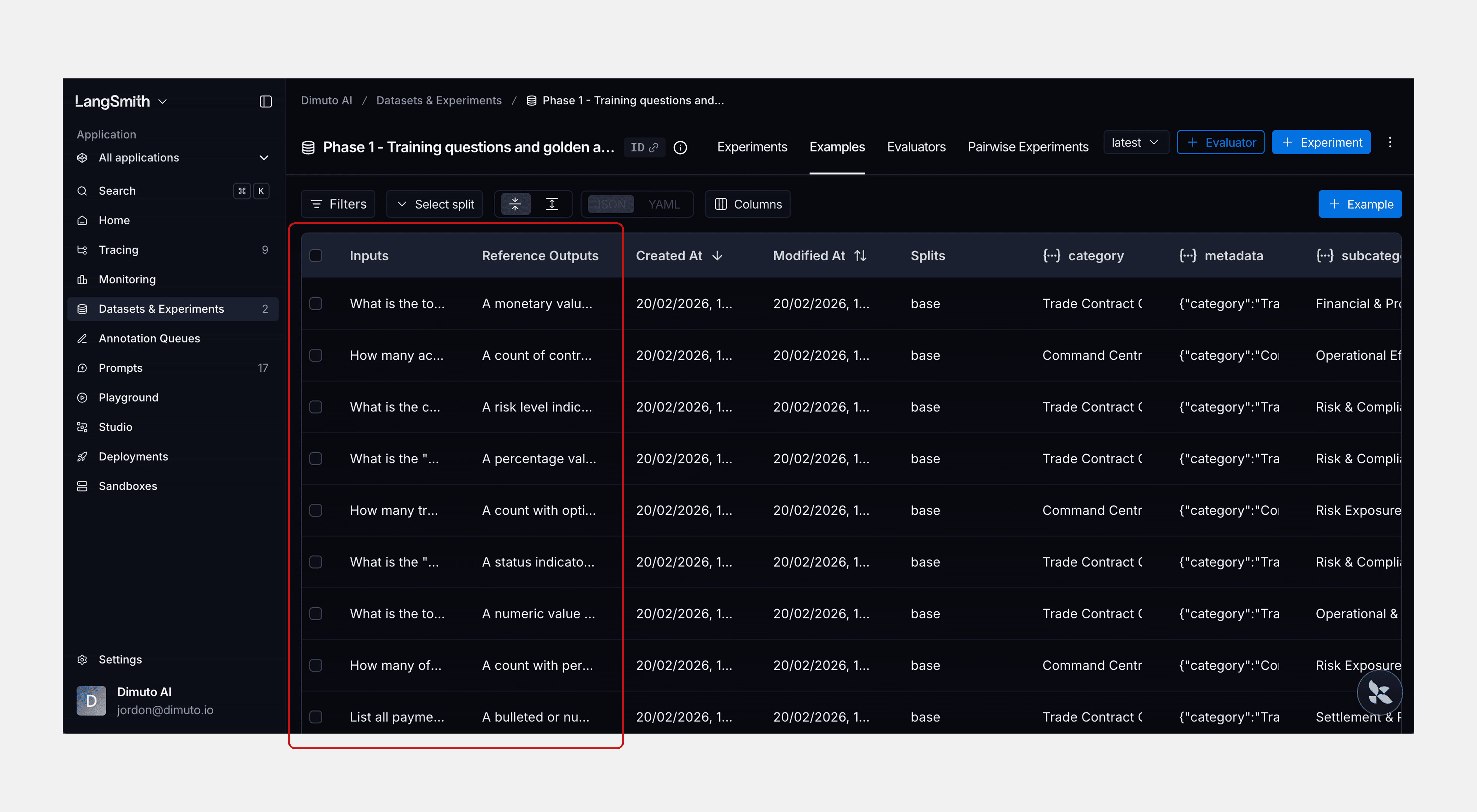
I set up an evaluation framework in LangSmith using 82 questions drawn from the persona-based tasks defined during discovery — spanning Financial Accuracy, Settlement Tracking, Operations, and Risk & Compliance.
Three automated evaluators ran against every response: latency, format compliance (checking whether outputs stuck to their intended structure — e.g., did a settlement query return a data card, not a paragraph?), and completeness (did the response address all parts of the question?). I developed the 82-question test set with these three evaluators; Guillermo then ran the evaluations and further optimised the assistant based on the results. We also tested the assistant in our sandbox environment to verify it met Phase 1's core standard: data accuracy.
Reflection
What designing for AI taught me
Designing for an agentic AI system was fundamentally different from traditional platform UX. With a standard interface, I can predict every state and output. With an AI assistant, the response changes based on the keywords and topics in the user's input, and pulls data from whichever page or module on the platform is relevant to the query. The biggest challenge was designing an output system that could accommodate that variability while still feeling consistent. Coming up with the anatomy (first-liner, main content, last-liner, CTAs, sources) gave the outputs a reliable structure. This structure makes the output consistent enough for users to learn and trust, manageable for the developer to build, and a structured pattern for the agent to follow regardless of the query.
Trust and transparency were central to every design decision. From the collapsible sources section to the first-liner loading states to the feedback CTAs, the assistant needed to earn and maintain the user's trust with every interaction, and through generating consistent and reliable outputs.
The project was paused after Phase 1 due to shifting business priorities, but the foundation is already proving its value. The AI engineer is currently training a compliance agent for the platform, built on the design structure and output system we established in Phase 1.